Visual identity of the Dutch national teams / 2015
client: KNVB
The term Oranje was found by the orange fans during the successes of the national team in the late 80's. During the 90's the 'Orange legion' became a new phenomenon within the world of football and it was well exploited in the decades after that. Now the terminology has officially become a brand. Oranje stands for the true feeling of supporting any orange team to the upmost. A sincere support during ups and downs. True orange, a brand of color.
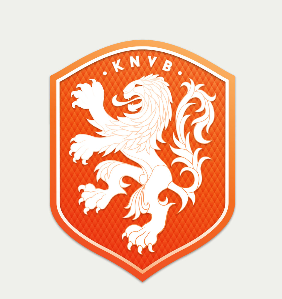
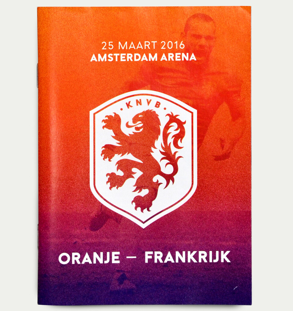
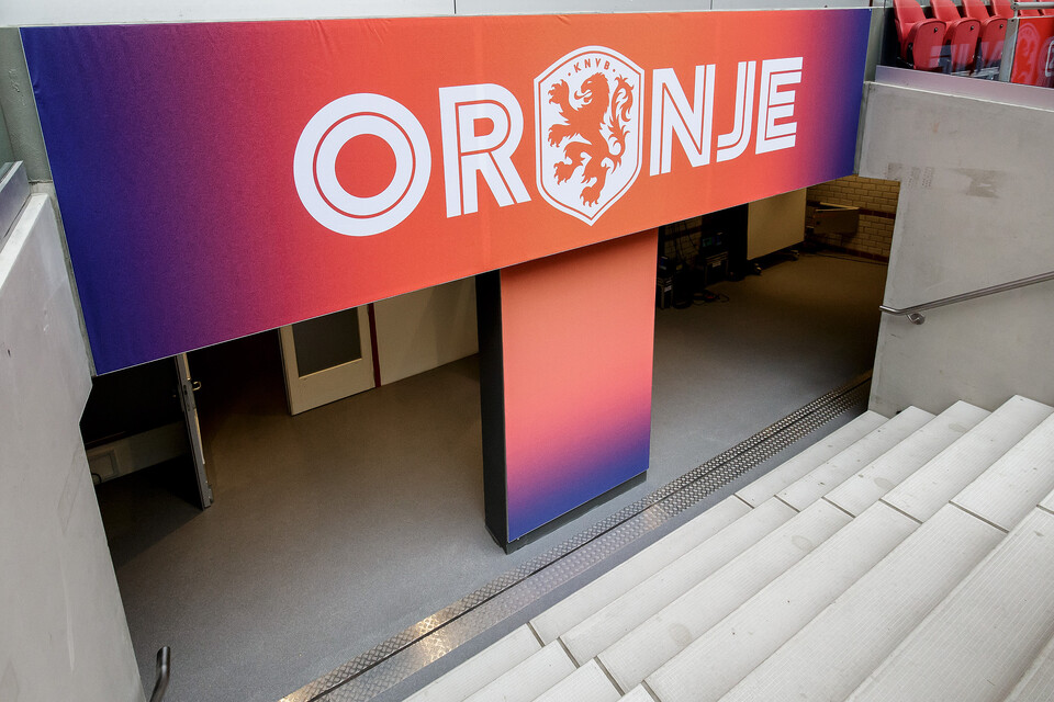
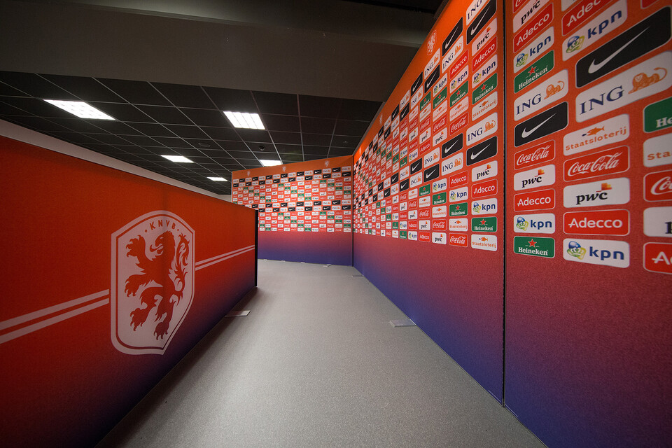
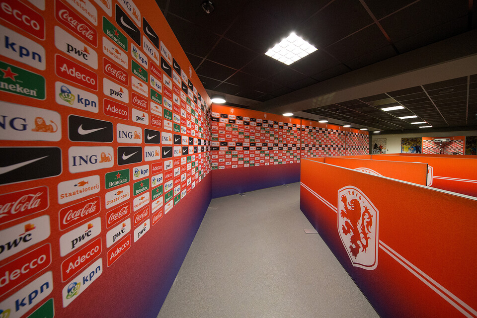
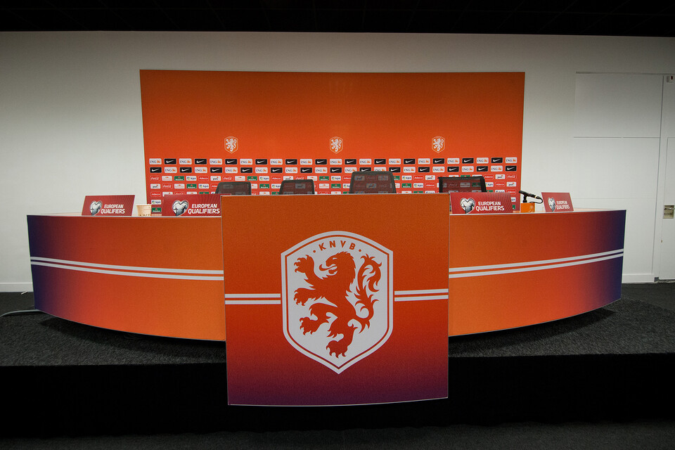
We've created an identity with a durable logo with can be filled in seasonally –with every season detailed colors might change within the kit– next to that a core crest of true oranje and white is leading. The lion we drew for the anniversary crest of 2014 has become the key element of the brand. Oranje is symbolized by this lion and it is captured by the shape of the crest. The crest is an alternative shape to the A in ORANJE. Any additional elements are connected to the ever changing seasons of the football world. This is our Oranje, true Oranje, together.