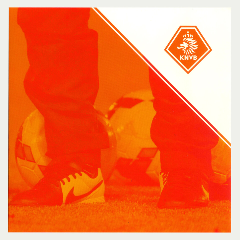
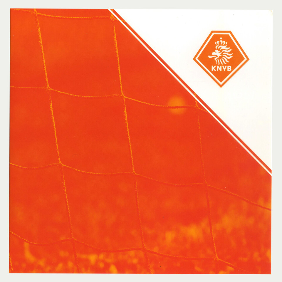
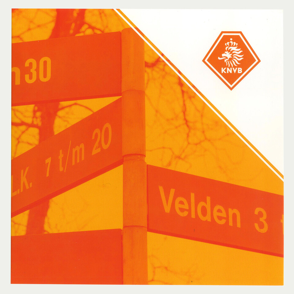
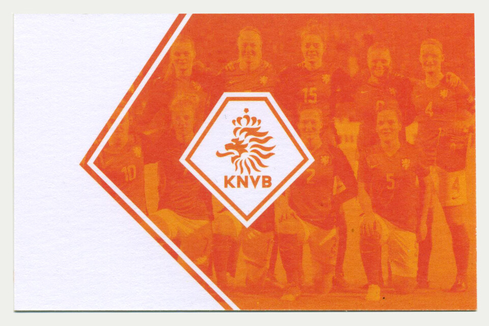
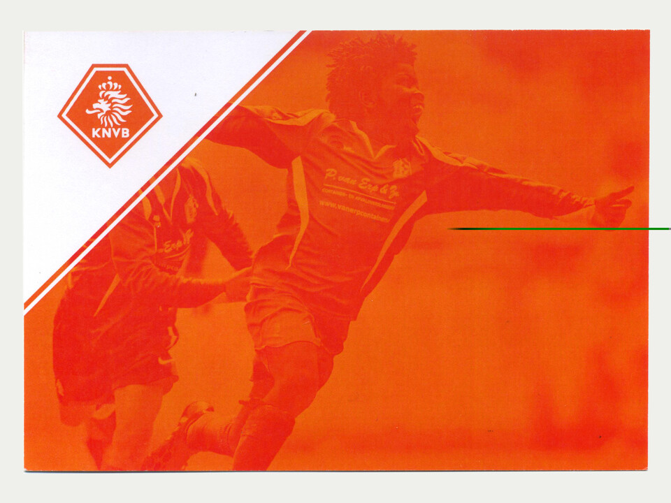
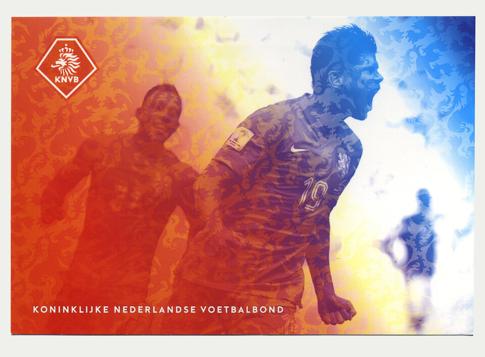
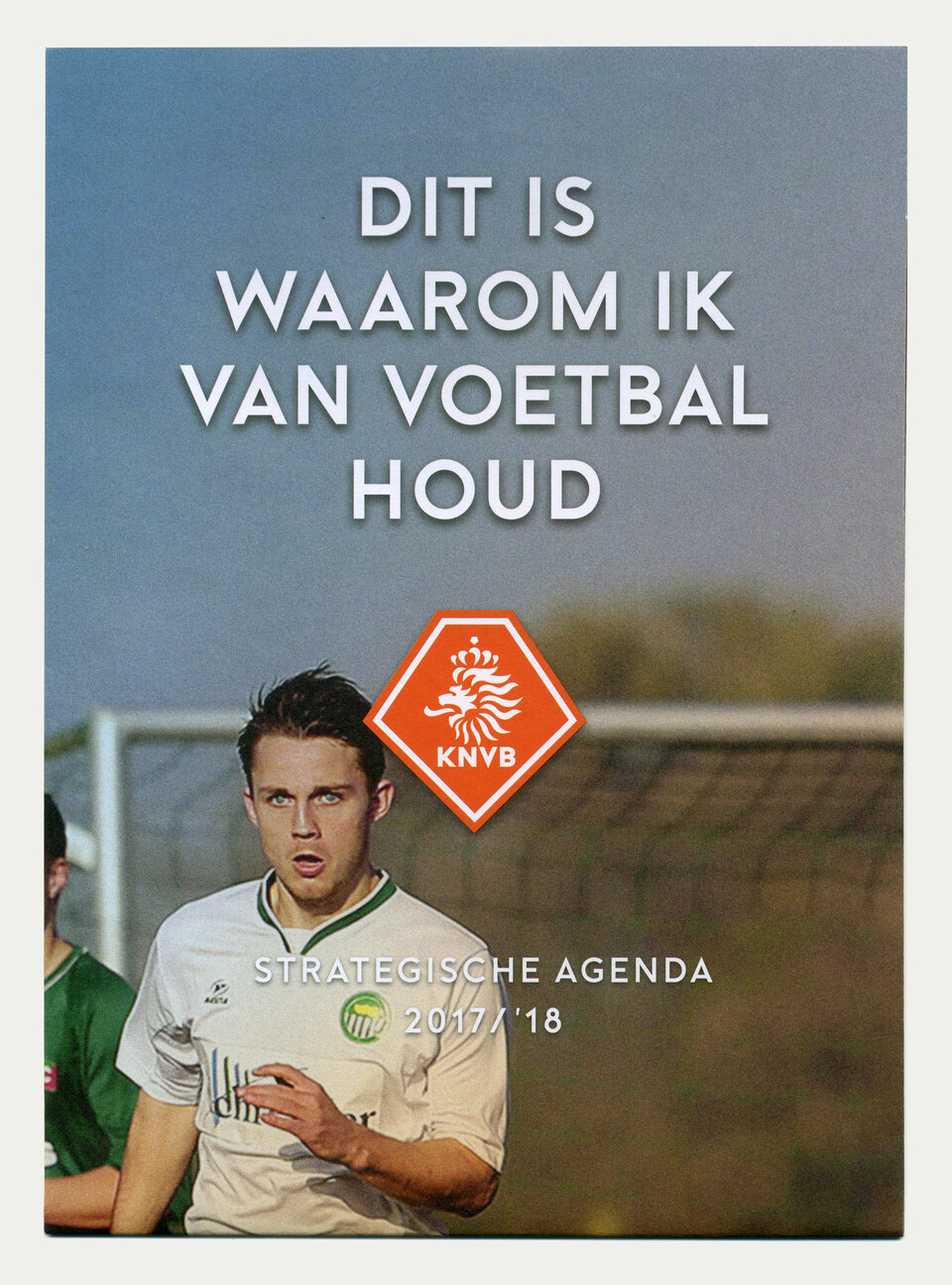
Corporate identity Dutch Football federation
Studio Wesseling is responsible for the identity of the Dutch football federation on every aspect of its visibility. For the corporate part of the federation we've created a sharp pentagon as the base of the identity using its shape as additional elements as well. The older logo designed by the company of the late Rolf Leeser is polished and sharpened to fit the 'shield'. The colors are registered as 'oranje blanje bleu', classical Dutch colors orange white blue.
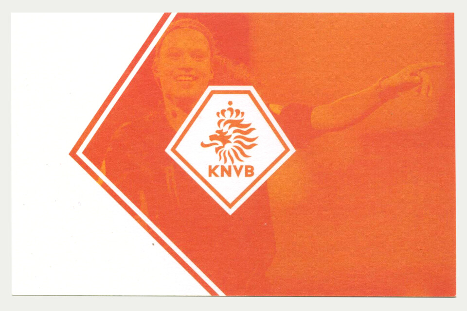
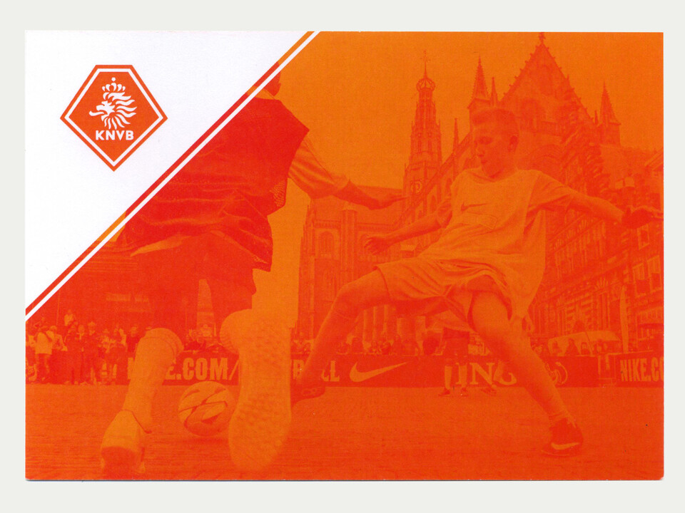
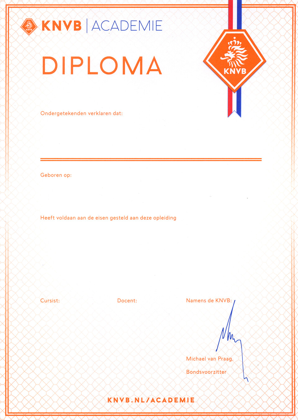
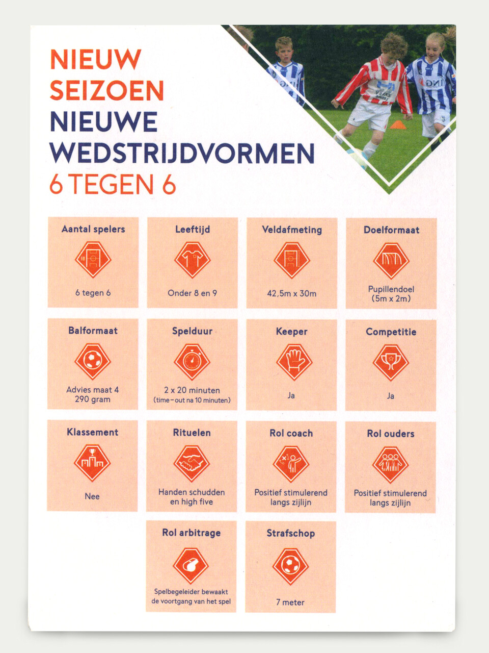
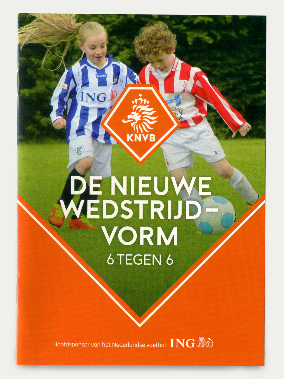
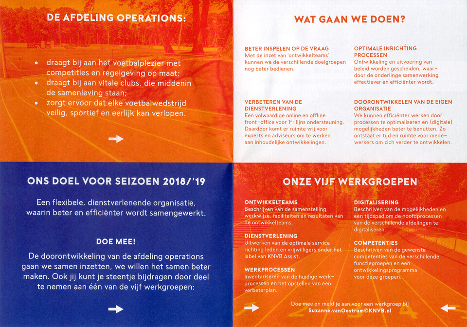
We do booklets, banners, certificates, correspondences, diplomas, infographics, online material, reports, presentations, etc. everything the federation needs on a yearly base. We cooperate with external parties to protect the identity and advice on how the visuals work. One of those project examples is the KNVB website, made by Momkai. The website is divided into 4 divisions, each with a subdivision of the federation designed by us: Corporate, Oranje, KNVB cup and Voetbal.nl